28 Aug 2022
This post is a continuation of my exploration of DiffSharp, an F# Automatic Differentiation library.
In the previous post, I covered some introductory elements of Maximum Likelihood Estimation,
through a toy problem, estimating the likelihood that a sequence of heads and tails had been generated by
a fair coin.
In this post, I will begin diving into the real-world problem that motivated my interest.
The general question I am interested in is about reliability. Imagine that you have a piece of equipment,
and that from time to time, a component of that piece of equipment experiences failures. When that happens,
you replace the defective component with a new one, restart the equipment, and proceed until the next failure.
The log for such a process would then look something like this:
Jan 07, 2020, 08:37  Component failure
Jan 17, 2020, 13:42  Component failure
Feb 02, 2020, 06:05  Component failure
Feb 06, 2020, 11:17  Component failure
If you wanted to make improvements to the operations of your equipment, one useful technique would be to simulate
that equipment and its failures. For instance, you could evaluate a policy such as “we will pre-emptively replace
the Component every week, before it fails”. By simulating random possible sequences of failures, you could then
evaluate how effective that policy is, compared to, for instance, waiting for the failures to occur naturally.
However, in order to run such a simulation, you would need to have a model for the distributions of these failures.
The log above contains the history of past failures, so, assuming nothing changed in the way the equipment is
operated, it is a sample of the failure distribution we are interested in. We should be able to use it, to
estimate what parameters are the most likely to have generated that log. Let’s get to it!
Environment: dotnet 6.0.302 / Windows 10, DiffSharp 1.0.7
Full code on GitHub
Weibull time to failure
What we are interested in here is the time to failure, the time our equipment runs from the previous component
replacement to its next failure. A classic distribution used to model time to failure is the Weibull distribution.
More...
21 Aug 2022
This post is intended as an exploration of DiffSharp, an Automatic Differentiation, or autodiff
F# library. In a nutshell, autodiff allows you to take a function expressed in code - in our case, in F# -
and convert it in an F# function that can be differentiated with respect to some parameters.
For a certain niche population, people who care about computing gradients, this is very powerful. Basically,
you get gradient descent, a cornerstone of machine learning, for free.
DiffSharp has been around for a while, but has undergone a major overhaul in the recent months. I hadn’t had
time to check it out until now, but a project I am currently working on gave me a great excuse to look into these
changes. This post will likely expand into more, and is intended as an exploration, trying to figure out
how to use the library. As such, my code samples will likely be flawed, and should not be taken as guidance.
This is me, getting my hands on a powerful and complex tool and playing with it!
With that disclaimer out of the way, let’s dig into it. In this installment, I will take a toy problem,
a much simpler version of the real problem I am after, and try to work my way through it. Using DiffSharp for
that specific problem will be total overkill, but will help us introduce some ideas which we will re-use
later, for the actual problem I am interested in, estimating the parameters of competing random processes
using Maximum Likelihood Estimation.
Environment: dotnet 6.0.302 / Windows 10, DiffSharp 1.0.7
An unfair coin
Let’s consider a coin, which, when tossed in the air, will land sometimes Heads, sometimes Tails. Imagine
that our coin is unbalanced, and tends to land more often than not on Heads, 65% of the time:
type Coin = {
    ProbabilityHeads: float
    }

let coin = { ProbabilityHeads = 0.65 }
Supposed now that we tossed that coin in the air 20 times. What should we expect?
More...
23 Jan 2022
For the longest time, my go-to charting library for data exploration in F# was XPlot. It did what I wanted, mostly: create “standard” charts using Plotly to visualize data and explore possible interesting patterns. However, from time to time, I would hit limitations, preventing me from using some of the more advanced features available in Plotly.
Fortunately, there is a new game in town with Plotly.NET. Thanks to the wonderful work of @kMutagene and contributors, we can now create a very wide range of charts in .NET, via Plotly.js.
At that point, I have made the switch to Plotly.NET. In this post, rather than go over the basics, which are very well covered in the documentation, I will dig into some more obscure charting features. Part of this post is intended as “notes to self”: Plotly has a lot of options, and finding out how to achieve some of the things I wanted took some digging in the docs. Part of it is simply a fun exploration of charts that are perhaps less known, but can come in handy.
Without further due, let’s start!
1: Splom charts
When you have 2 continuous variables and want to identify a possible relationship between them, scatterplots are your friend. For illustration, imagine you had a dataset of wines, where for each wine you know the type (red or white), and a bunch of chemical measurements:
type Wine = {
    Type: string
    FixedAcidity: float
    VolatileAcidity: float
    CitricAcid: float
    ResidualSugar: float
    Chlorides: float
    FreeSulfurDioxide: float
    TotalSulfurDioxide: float
    Density: float
    PH: float
    Sulphates: float
    Alcohol: float
    Quality: float
    }
Are PH and Fixed Acidity related? Let’s check:
Chart.Scatter(
    dataset |> Seq.map (fun x -> x.PH, x.FixedAcidity),
    StyleParam.Mode.Markers
    )
|> Chart.withXAxisStyle("PH")
|> Chart.withYAxisStyle("Fixed Acidity")
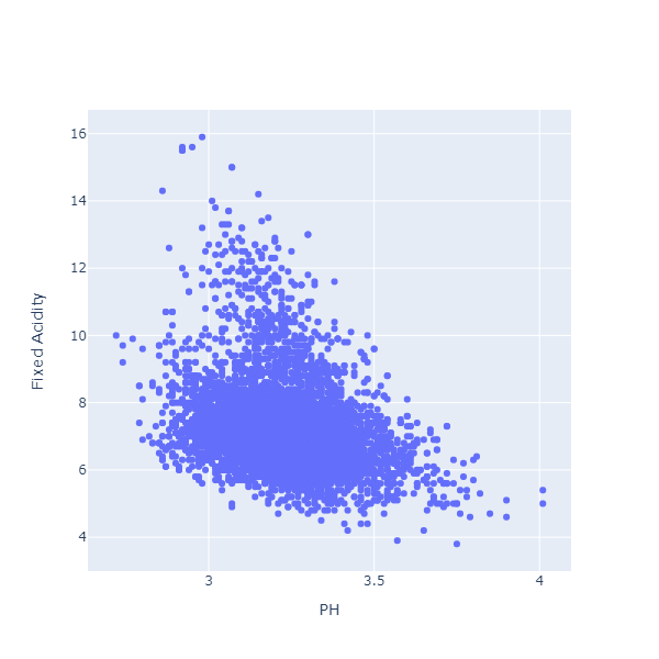
It looks like there is a relationship indeed: when fixed acidity is high, PH tends to be lower.
Are there other interesting relationship between variables? This is a great question, but, with 12 variables, we would need to create and inspect 55 distinct scatterplots. That is a bit tedious.
Enter the Scatterplot Matrix, or SPLOM in short:
Chart.Splom(
    [
        "alcohol", dataset |> Seq.map (fun x -> x.Alcohol)
        "chlorides", dataset |> Seq.map (fun x -> x.Chlorides)
        "citric acid", dataset |> Seq.map (fun x -> x.CitricAcid)
        "density", dataset |> Seq.map (fun x -> x.Density)
        "fixed acidity", dataset |> Seq.map (fun x -> x.FixedAcidity)
    ]
    )
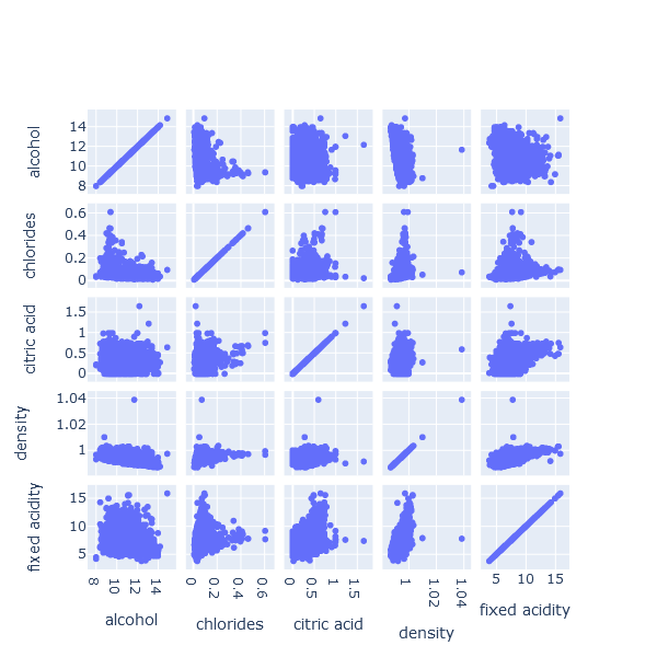
A SPLOM displays all the scatterplots between variables in a grid, giving us a quick visual scan for whether obvious relationships exist. It will not scale well to wider datasets (if we have many columns/features), but for a dataset like this one, with a limited number of features, it is very convenient.
2: Violin and Boxplot charts
Suppose we wanted to examine the relationship between the alcohol level of a wine, and its quality, that is, how it was rated by people. These are both numeric variables, so let’s create another scatterplot:
Chart.Scatter(
    dataset |> Seq.map (fun x -> x.Quality, x.Alcohol),
    StyleParam.Mode.Markers
    )
|> Chart.withXAxisStyle("Quality")
|> Chart.withYAxisStyle("Alcohol")
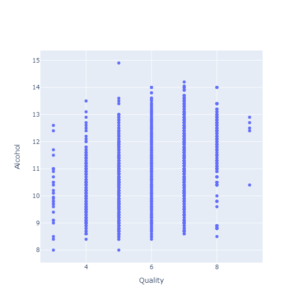
That is not a very enlightening chart. The problem here is that ratings are integers: Each wine receives a grade between 0 and 10. As a result, all the dots are clumped on the same vertical lines, each one corresponding to one of the ratings.
Instead of a scatterplot, we could use a Violin chart here:
Chart.Violin(
    dataset |> Seq.map (fun x -> x.Quality, x.Alcohol)
    )
|> Chart.withXAxisStyle("Quality")
|> Chart.withYAxisStyle("Alcohol")
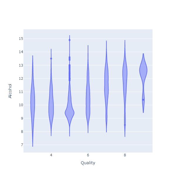
What the chart shows is how the alcohol level is distributed, for each of the quality levels. What I see on this chart is that, for wines that have received a higher rating, the distribution is thicker at the top. In other words, people tend to prefer wines with a higher alcohol level.
Boxplot charts serve a similar purpose:
Chart.BoxPlot(
    dataset |> Seq.map (fun x -> x.Quality, x.Alcohol)
    )
|> Chart.withXAxisStyle("Quality")
|> Chart.withYAxisStyle("Alcohol")
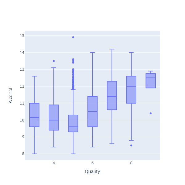
Instead of representing the full distribution, the chart displays 5 values for each group: a box with the median, the 25% and 75% percentiles, and the min and max values. In plain English, the chart shows where most of the observations fell (the box), and how extreme it could get (the min and max).
A nice feature of Plotly.NET is the ability to stack charts with a shared X Axis. As an example, imagine we wanted to see if the pattern we found before (more alcohol, happier customers) applies equally to red and white wines. One way we could check that is to split the data by wine type, and stack boxplots, like so:
[
    Chart.BoxPlot(
        dataset
        |> Seq.filter (fun x -> x.Type = "red")
        |> Seq.map (fun x -> x.Quality, x.Alcohol)
        )
    |> Chart.withYAxisStyle("Red / Alcohol")

    Chart.BoxPlot(
        dataset
        |> Seq.filter (fun x -> x.Type = "white")
        |> Seq.map (fun x -> x.Quality, x.Alcohol)
        )
    |> Chart.withYAxisStyle("White / Alcohol")
]
|> Chart.SingleStack(Pattern= StyleParam.LayoutGridPattern.Coupled)
|> Chart.withXAxisStyle("Quality")
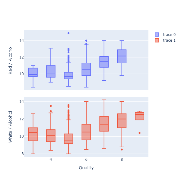
We can now see both charts side-by-side, and confirm that the pattern appears to hold, regardless of whether the wine is red or white.
3: 2D Histogram and Contour charts
Let’s consider another pair of variables, Alcohol Level and Fixed Acidity, starting with a Scatterplot:
Chart.Scatter(
    dataset |> Seq.map (fun x -> x.Alcohol, x.FixedAcidity),
    StyleParam.Mode.Markers
    )
|> Chart.withXAxisStyle("Alcohol")
|> Chart.withYAxisStyle("Fixed Acidity")
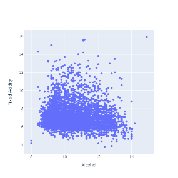
Again, this scatterplot is a bit difficult to parse, because we have a large clump of observation all bunched together. Instead of looking at the individual dots, what might help would be to see where we have dense clumps of points.
Chart.Histogram2D (
    dataset |> List.map (fun x -> x.Alcohol),
    dataset |> List.map (fun x -> x.FixedAcidity),
    NBinsX = 20,
    NBinsY = 20
    )
|> Chart.withXAxisStyle("alcohol")
|> Chart.withYAxisStyle("fixed acidity")
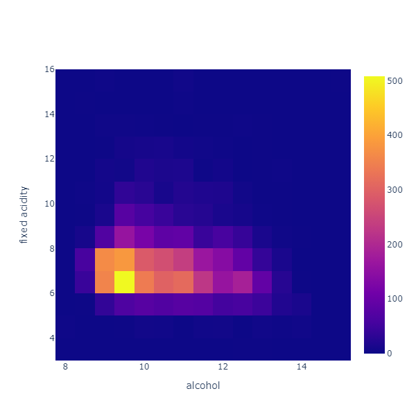
This chart divides the data in a grid of 20 x 20 equal cells along each variable, and counts how many observations fall into each cell. Think of it as a grid of histograms seen from above, where the color indicates how high the column rises.
Expanding on this idea, we could imagine that this grid represents altitudes. The Contour chart does just that:
Chart.Histogram2DContour(
    dataset |> List.map (fun x -> x.Alcohol),
    dataset |> List.map (fun x -> x.FixedAcidity),
    NBinsX = 20,
    NBinsY = 20,
    NCountours = 20
    )
|> Chart.withXAxisStyle("alcohol")
|> Chart.withYAxisStyle("fixed acidity")
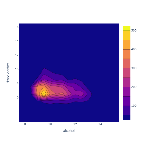
As for the Histogram2D, we put all the datapoints in a 20 x 20 grid, and count the observations. The chart then renders this as an altitude map, showing where most of the observations are, and creating isolines for fictional altitude levels, interpolated from the data.
In this case, we can see that most observations are concentrated at a peak around 9.5 alcohol, 6.5 fixed acidity, and stretch along a ridge corresponding to a fixed acidity level of around 6.5. In other words, the 2 variables appear to be unrelated: for all alcohol levels, the changes in fixed acidity are similar.
4: Line Shape
For our 2 last examples, we will leave the wine dataset aside.
Imagine that you are tracking the behavior of a device, which is either on or off. The log for such a device would look like time stamps, and perhaps 0 and 1s, indicating when the device stopped or restarted.
We can easily simulate something along these lines:
let rng = Random(0)
let startTime = DateTime(2022, 1, 1)

let performanceSeries =
    (startTime, 0.0)
    |> Seq.unfold (fun (time, value) ->
        let nextTime = time.AddMinutes (rng.NextDouble())
        let nextValue =
            if value = 0.0 then 1.0 else 0.0
        Some ((time, value), (nextTime, nextValue))
        )
    |> Seq.take 10
    |> Seq.toArray
This produces a performanceSeries like this:
2022-01-01 00:00:00Z, 0
2022-01-01 00:00:43Z, 1
2022-01-01 00:01:32Z, 0
2022-01-01 00:02:18Z, 1
2022-01-01 00:02:52Z, 0
etc ...
Let’s plot that series:
Chart.Scatter(
    performanceSeries,
    StyleParam.Mode.Lines_Markers
    )
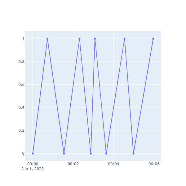
This is easy enough to create, but is not painting a correct picture of what is happening. Our device can only be in one of two states: 0 or 1, but the chart connects all the dots with straight line. As a result, it is difficult to see for how long the device was active or inactive. Can we do better?
Chart.Scatter(
    performanceSeries,
    StyleParam.Mode.Lines_Markers,
    Line = Line.init(Shape = StyleParam.Shape.Hv)
    )
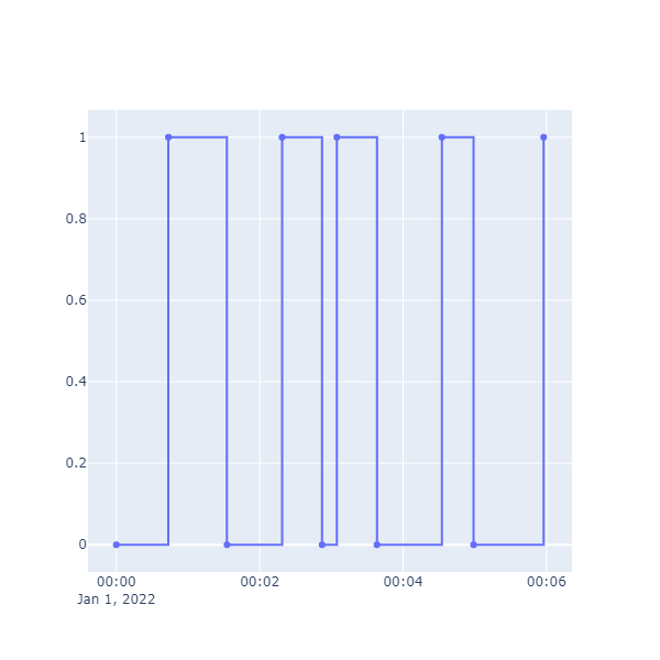
What does the Shape parameter do? Shape comes in a few different flavors, in this case HV for “horizontal, vertical”. From a data point, start horizontally until the next value is reached, and there make a vertical move.
5: Density and Cumulative charts
Let’s finish up with a different problem. Imagine you were regularly playing a game involving 20-sided dice, and were asked the following question: is it better to roll twice and take the best roll, or to roll once, and add 2 to the result?
Let’s build a simulation, rolling 10,000 times for each option:
let advantageRolls =
    Array.init 10000 (fun _ ->
        let roll1 = rng.Next(1, 21)
        let roll2 = rng.Next(1, 21)
        max roll1 roll2
        )

let bonusRolls =
    Array.init 10000 (fun _ ->
        let roll = rng.Next(1, 21)
        roll + 2
        )
The Chart.Histogram function will plots the distribution of the data as a histogram, for instance:
Chart.Histogram(advantageRolls)
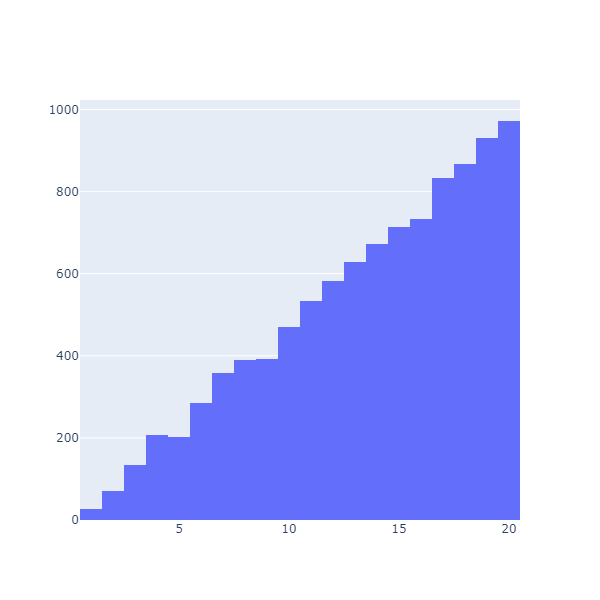
Chart.Histogram(bonusRolls)
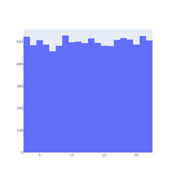
These are densities: they display how many observations fall in each bucket (or bin). This is useful (we can see that the results are clearly very different), but not very convenient to compare how much better one option might be compared to the other. What we would like is something along the lines of “what are the chances of getting more than a certain value”.
As it turns out, this has a name. What we want is the Cumulative Distribution, the probability of getting less than a certain value. Let’s do that, using HistNorm to convert the raw values into percentages:
Chart.Histogram(
    advantageRolls,
    Cumulative = TraceObjects.Cumulative.init(true),
    HistNorm = StyleParam.HistNorm.Percent
    )
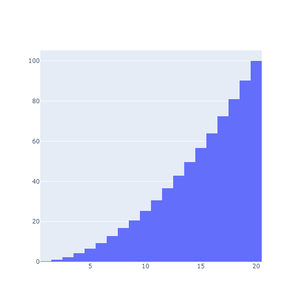
This is much better: now we can directly read that we have an 80.98% chance of getting 18 or less, or, alternatively, an almost 20% chance of getting a 19 or 20.
Can we plot the 2 cumulatives together? With a bit of work, we can:
[
    Chart.Histogram(
        advantageRolls,
        Name = "Advantage",
        Opacity = 0.5,
        OffsetGroup = "A",
        Cumulative =
            TraceObjects.Cumulative.init(
                true,
                StyleParam.CumulativeDirection.Decreasing
                ),
        HistNorm = StyleParam.HistNorm.Percent
        )
    Chart.Histogram(
        bonusRolls,
        Name = "Bonus +2",
        Opacity = 0.5,
        OffsetGroup = "A",
        Cumulative =
            TraceObjects.Cumulative.init(
                true,
                StyleParam.CumulativeDirection.Decreasing
                ),
        HistNorm = StyleParam.HistNorm.Percent
        )
]
|> Chart.combine
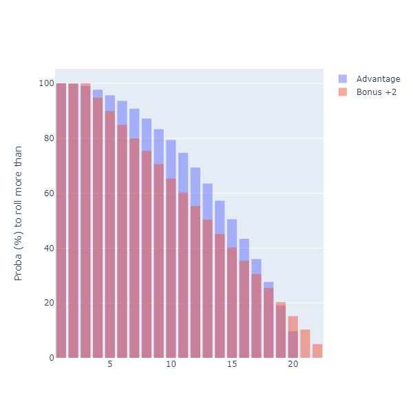
We are using a few tricks here. First, we set the Cumulative to a decreasing direction: instead of showing the probability of rolling less than a given number, our chart displays now the probability of getting more than a given number. As a result, we can directly read “what is the chance of rolling more than 15”, for instance.
The second trick is the use of OffsetGroup. There might be a better way to achieve this, but I wanted to have the two curves on top of each other. By assigning them to the same offset group, they end up being superposed.
Because we set the curves to a 50% Opacity, we see at the top of the curve the strategy that has the best probability of succeeding, by level. Interestingly, the chart shows that the question “which one is better” is an ill-formed question, and depends on the goal. In most cases, the “Advantage” strategy (roll twice, keep the best) dominates. However, if you need to roll a 19 or anything higher, you should take the “Bonus +2” strategy.
As a side note, what I’d really like is not a histogram, but a line / scatterplot that represents the cumulative, without binning. I can create this by preparing the data myself and using a scatterplot, but if someone knows of a way to directly produce this using Plotly.NET, I would love to hear about it!
Conclusion
That is what I got today! I realize that this post might be a bit of a hodge-podge, but hopefully this will either encourage you to give Plotly.NET a spin if you haven’t yet, or given you ideas otherwise :)
Ping me on Twitter if you have comments or questions, and… happy coding!
More...